

Figures in scientific papers often look less than professional, and
sometimes this can even get in the way of understanding the figure. In this
blog post we show how to use matplotlib and tikzplotlib to make
publication ready figures that look great and can be styled from the document
preamble. Beautiful and understandable figures can possibly lead to higher publication acceptance rate, at least I hope so…
Introduction
For generating figures in my scientific papers I use
TikZ (Tantau, 2007) but
until recently I have been using matplotlib (Hunter, 2007) for
graphs and saved them as PDF. When I found
tikzplotlib (Schlömer, 2019) I found it to be awesome but needing a few tweaks. tikzplotlib is a Python tool for converting matplotlib figures into PGFPlots (Feuersänger, 2014) figures for inclusion into LaTeX documents.
If there’s one thing I loath (and you should too), it’s chartjunk
(Tufte, 1986). We should avoid chartjunk at all cost.
Chartjunk is everything in your figure that dilutes your message and adds
confusion (Rougier et al., 2014). Before tikzplotlib, I spent a lot of time
styling individual plots with matplotlib. With tikzplotlib we can put most
of that styling in the LaTeX document header.
In this blog post we will explore matplotlib and tikzplotlib, remove some
chartjunk and build a pipeline to include matplotlib images in LaTeX figures.
Using tikzplotlib
Making a plot
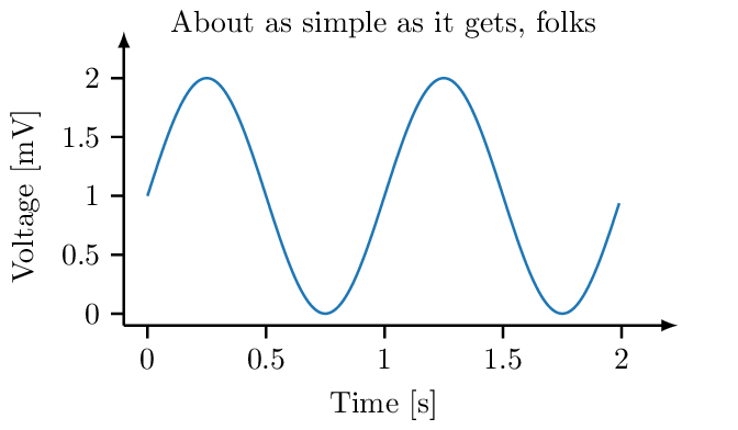
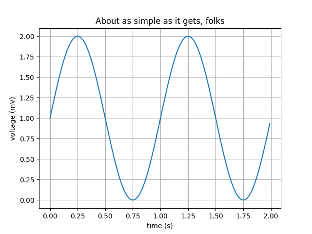
The first thing we need to do is to make a plot. We’ll look at
the simple plot
example from the matplotlib gallery (Hunter et al., 2019). In my opinion this example has the
appearance of a matplotlib plot, and I’d like it to look a little more
professional.
1
2
3
4
5
6
7
8
9
10
11
12
13
14
15
import matplotlib.pyplot as plt
import numpy as np

# Data for plotting
t = np.arange(0.0, 2.0, 0.01)
s = 1 + np.sin(2 * np.pi * t)

fig, ax = plt.subplots()
ax.plot(t, s)

ax.set(xlabel='Time [s]', ylabel='Voltage [mV]',
       title='About as simple as it gets, folks')

import tikzplotlib
tikzplotlib.save("figure.pgf")
At the end we are importing tikzplotlib and using the save function to save a tikz file containing the plot.
For this example, we are using the following packages.
matplotlib==3.1.1
tikzplotlib==0.8.2
Now we are ready to include this file in a document. Here we are using a TikZ
standalone-document as an example to include the tikz code in the document,
but some publishers rather want you to include a PDF-version.
1
2
3
4
5
6
7
8
9
10
11
12
13
14
15
16
17
18
19
20
21
22
23
24
25
26
27
28
\documentclass[tikz,crop,convert={density=200,outext=.png}]{standalone}

\usepackage{pgfplots}
\usetikzlibrary{arrows.meta}

\pgfplotsset{compat=newest,
    width=6cm,
    height=3cm,
    scale only axis=true,
    max space between ticks=25pt,
    try min ticks=5,
    every axis/.style={
        axis y line=left,
        axis x line=bottom,
        axis line style={thick,->,>=latex, shorten >=-.4cm}
    },
    every axis plot/.append style={thick},
    tick style={black, thick}
}
\tikzset{
    semithick/.style={line width=0.8pt},
}
\usepgfplotslibrary{groupplots}
\usepgfplotslibrary{dateplot}

\begin{document}
\input{figure.pgf}
\end{document}
We can compile this as a standalone figure into PNG and PDF by running
pdflatex -shell-escape figure.tex.
Tweaking the output
If we look at the LaTeX code above, we see pgplotset with some options.
These options are used to set a fixed size of the plot area (excluding the
axes labels and the title), set the number of tickmarks etc. We are also
redefining the line width semithick to be as thick as thick.
The bounding box of figures produced in this way can be slightly different
depending on the labels and title and other things drawn outside the plot area.
This is usually not a problem, but will be painfully obvious if two figures
are placed side-by-side. Therefore, we need to manually set the bounding box.
We do this with a sed hack that inserts a path on line 3 in the file figure.pgf.
sed -i -e '3i \\\path (-1.2,-1.1) rectangle (7.1cm, 3.6cm);' figure.pgfThis will add an invisible rectangle outside the figure, which will be used by TikZ to determine the bounding box. It will be the same for every figure we make, and in this way we can make sure that two figures side by side will line up perfectly.
Other tweaks are possible too. We can for example add parameters to the axis parameters
tikzplotlib.save(
  "myplot.tex",
  extra_axis_parameters=["colorbar style={xshift=12mm}"],
  override_externals=True,
  tex_relative_path_to_data="figures/")
See the documentation for more details.
Automation
To automate this build, we can use the following Makefile. The input files
are figure.py and figure.tex, both of which are listed above.
1
2
3
4
5
6
7
8
9
10
11
12
all: figure.png

%.pgf: %.py
	python3 $<
	gsed -i -e '3i \\\path (-1.2,-1.1) rectangle (7.1cm, 3.6cm);' $@

%.png: %.tex %.pgf
	pdflatex -shell-escape $<

clean:
	-rm figure.pgf figure.png
	-latexmk -C figure
We want to create the file figure.png. To do this we start with running
Python to generate the .pgf file that we then include in figure.tex.
Compiling figure.tex renders the figure and saves it as a .png. We get
a .pdf for free when using pdflatex.
Including the figure in a document
We need to include the produced figure into a figure environment in our
document, and for this we can write the LaTeX code
below (Wikibooks, 2019).
1
2
3
4
5
\begin{figure}
    \centering
    \input{figure.pgf}
    \caption{Example figure produced with this method.}
\end{figure}
If your publisher requires you to submit a manuscript with PDF figures, you can
use the standalone document above and use the standard \includegraphics
command instead of the \input command.
Related Work
(Rougier et al., 2014) listed ten simple rules for better figures, of which
rule number 5 was Do not trust the default and number 8 was related to
avoiding chartjunk. It also listed a few good tools, among others
matplotlib, TikZ and PGF, but didn’t tell us how to use them.
The entire library of work by Edward Tufte is hugely inspirational to us. (Tufte, 1986) tells us not to put too much ink on the paper and gives us examples on how to achieve this.
(Vandenbroucke, 2019) teaches us how to use TikZ for non-plots. Besides being a good introduction to TikZ we also learn how to compile standalone pictures and how to embed the TikZ code into a LaTeX figure.
matplotlib (Hunter, 2007) has support for
style sheets
where you can use existing styles or create
your own styles. This can make your figures look much nicer, quite easily. In
this way we delegate styling to matplotlib as opposed to
TikZ (Tantau, 2007) in this work.
Conclusion
We have looked at how to make matplotlib figures look more professional by
using tikzplotlib and some tweaks. The Makefile we created should go into
the figures directory of your manuscript so that you can use make -C figures
all as a dependency to your normal make report target.
I find it easy to control the style of my plots from the preamble of my manuscript and just rebuild the plots if the content changed.
In my humble opinion, easily understandable figures that makes it easy for a reviewer to understand the message that your are trying to send, should make it harder for the reviewer to reject your paper. In fact there is some evidence (Huang, 2018) that the visual appearance of a paper is important and that improving the paper gestalt reduces risk of getting rejected.
References
- Tantau, T. (2007). The TikZ and pgf Packages. 1–405. https://www.ctan.org/pkg/pgf
- Hunter, J. D. (2007). Matplotlib: A 2D graphics environment. Computing in Science & Engineering, 9(3), 90–95. https://doi.org/10.1109/MCSE.2007.55
- Schlömer, N. (2019). tikzplotlib. github. https://github.com/nschloe/tikzplotlib
- Feuersänger, C. (2014). Manual for Plotting Package pgfplots. 1–500. https://ctan.org/pkg/pgfplots
- Tufte, E. R. (1986). The Visual Display of Quantitative Information. Graphics Press. https://www.edwardtufte.com/tufte/books_vdqi
- Rougier, N. P., Droettboom, M., & Bourne, P. E. (2014). Ten Simple Rules for Better Figures. PLoS Computational Biology, 10(9), 1–7. https://doi.org/10.1371/journal.pcbi.1003833
- Hunter, J., Dale, D., Firing, E., Droettboom, M., & Others. (2019). Simple plot. Matplotlib. https://matplotlib.org/3.1.1/gallery/lines_bars_and_markers/simple_plot.html
- Wikibooks. (2019). LaTeX/Floats, Figures and Captions — Wikibooks, The Free Textbook Project. https://en.wikibooks.org/w/index.php?title=LaTeX/Floats,_Figures_and_Captions&oldid=3570319
- Vandenbroucke, B. (2019). Making diagrams and flowcharts with LaTeX: TikZ. https://bertvandenbroucke.netlify.com/2019/01/13/making-diagrams-and-flowcharts-with-latex-tikz/
- Huang, J.-B. (2018). Deep Paper Gestalt. CoRR, abs/1812.0. http://arxiv.org/abs/1812.08775
Suggested citation
If you would like to cite this work, here is a suggested citation in BibTeX format.
@misc{isaksson_2019,
  author="Isaksson, Martin",
  title={{Martin's blog --- Create publication ready figures with Matplotlib and TikZ}},
  year=2019,
  url=https://blog.martisak.se/2019/09/29/publication_ready_figures/,
  note = "[Online; accessed 2026-07-05]"
}