

Tables in scientific papers often look less than professional, and sometimes this can even get in the way of understanding the message. In this blog post we will learn how to add sparklines to a LaTeX table, which not only makes your table stand out, but also allows for conveying information about for example trends in time-series.
Introduction
In an earlier post, we looked at using Pandas (pandas development team, 2020; Wes McKinney, 2010 ) to produce nice looking tables with no manual steps. In this post we will take it one step further by adding sparklines (Tufte, 1986; Tufte, n.d.; Tufte, n.d.; Bissantz et al., 2007) to our table using
the sparklines (Löffler et al., 2017) LaTeX package.
A sparkline is a very small chart, often in a text or in a table without axis or coordinates, that presents some measurement in an “intense, simple, wordlike graphics”. For example, The Dow Jones Industrial Average for February 7, 2006  (Licensed under CC BY-SA 2.5).
Sparklines are useful to show trends, highlight important events in time-series etc, which are otherwise hard to convey to a reader. They are especially useful when there are many such time-series and a regular figure would take up too much valuable space. In this post we will add them to a LaTeX table, but they can be used in running text, in spreadsheets and in many other situations.
The code
The Python code
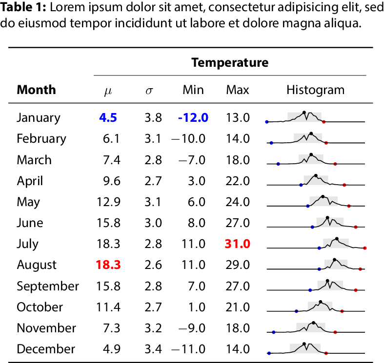
First we will need some data - here we use weather data from Seattle, a Plotly (Plotly Technologies Inc., 2015) dataset. We will take this opportunity to clean it a little bit.
1
2
3
4
5
6
7
8
9
10
11
12
13
14
15
16
17
18
# First download the data from plotly's GitHub repository
df = pd.read_csv(
    'https://raw.githubusercontent.com/plotly/datasets/master/2016-weather-data-seattle.csv')

df['month'] = pd.to_datetime(df['Date']).dt.month

# we define a dictionary with months that we'll use later
month_dict = {1: 'January', 2: 'February',
              3: 'March', 4: 'April',
              5: 'May', 6: 'June',
              7: 'July', 8: 'August',
              9: 'September', 10: 'October',
              11: 'November', 12: 'December'}

df = df.sort_values("month")
df["datetime"] = pd.to_datetime(df.Date)
df = df.drop(["Date"], axis=1)
df = df.dropna()
Now we would like to group this data per month. Thereafter, we apply a magic function f.
1
2
3
4
df4 = (df
       .groupby("month")
       .apply(f).reset_index()
       )
The function f will calculate the mean, standard deviation and those important, but frankly boring, metrics. More interestingly it do one more thing - it will render a sparkline (Tufte, 1986; Tufte, n.d.; Tufte, n.d.; Bissantz et al., 2007).
1
2
3
4
5
6
7
8
9
def f(x):
    d = {}

    d['max'] = x['Mean_TemperatureC'].max()
    d['mean'] = x['Mean_TemperatureC'].mean()
    d['std'] = x['Mean_TemperatureC'].std()
    d['min'] = x['Mean_TemperatureC'].min()
    d['sparkline'] = sparkline(x)
    return pd.Series(d, index=['mean', 'std', 'min', 'max', 'sparkline'])
Rendering the sparkline consists of writing a sparkline environment to file, so we won’t cover it here. See the full Python code here and the sparklines (Löffler et al., 2017) LaTeX package documentation.
The LaTeX Code
Now that we have generated our table using Pandas, we need to include it in
our document. See table.tex, where the included includes/macros.tex contains some libraries and macros that we need, see macros.tex.
Most importantly, we load the sparklines LaTeX package (Löffler et al., 2017). We also need to define a new command for a rectangle that is defined by its left and right values.
1
2
3
4
5
6
\def\sparkrectangleh #1 #2 {%
   \ifdim #1pt > #2pt
        \errmessage{The left corner #1 of rectangle cannot be lower than #2}%
   \fi
   {\pgfmoveto{\pgforigin}\color{sparkrectanglecolor}%
   \pgfrect[fill]{\pgfxy(#1, 0)}{\pgfxy(#2-#1,1)}}}%
Related work
spark (Blevins, 2013) is a LaTeX package for generating sparklines.
ltxsparklines: Lightweight Sparklines for a LaTeX Document (Veytsman, 2017) is an interface for R to sparklines(Löffler et al., 2017).
Conclusion
Adding a table to your paper is a good idea. It is also a good idea to invest some time into making this table easy to read instead of just presenting a wall of numbers. In an earlier post, we looked at using Pandas (pandas development team, 2020; Wes McKinney, 2010 ) to produce nice looking tables where we highlighted some summary statistics. In this post we took this one step further by adding sparklines (Tufte, 1986; Tufte, n.d.; Tufte, n.d.; Bissantz et al., 2007).
Easily digested tables makes it easier to understand the idea and the message we are trying to convey. In fact there is some evidence (Huang, 2018) that the visual appearance of a paper is important and that improving the paper gestalt reduces risk of getting a paper rejected. In order to convey an idea efficiently we need to remove barriers so that the reader can understand this idea with as little cognitive effort as possible, and hopefully we have presented one way of achieving this here. We leave it to the reader to integrate this method into a Python package that is easy to use.
References
- pandas development team, T. (2020). pandas-dev/pandas: Pandas (Version latest) [Software]. Zenodo. https://doi.org/10.5281/zenodo.3509134
- Wes McKinney. ( 2010 ). Data Structures for Statistical Computing in Python . In Stéfan van der Walt & Jarrod Millman (Eds.), Proceedings of the 9th Python in Science Conference (pp. 56–61 ). https://doi.org/ 10.25080/Majora-92bf1922-00a
- Tufte, E. R. (1986). The Visual Display of Quantitative Information. Graphics Press. https://www.edwardtufte.com/tufte/books_vdqi
- Tufte, E. Edward Tufte forum: Sparkline theory and practice Edward Tufte. https://www.edwardtufte.com/bboard/q-and-a-fetch-msg?msg_id=0001OR&topic_id=1
- Tufte, E. Edward Tufte forum: History of Sparklines and Edward Tufte Contribution. https://www.edwardtufte.com/bboard/q-and-a-fetch-msg?msg_id=000AIr
- Bissantz, N., Butterwegge, D. G., Manns, C., Rössel, M., Westphal, M., Schrage, G., Steinsträsser, R., & Zimmermann, R. (2007). Bissantz sparkline tools - sparklines for Excel, Word, PowerPoint, HTML and information tickers. https://web.archive.org/web/20070311173343/http://www.bissantz.com/sparklines/
- Löffler, A., Luecking, D. H., & van Miltenburg, E. (2017). sparklines – Drawing sparklines: intense, simple, wordlike graphics. https://www.ctan.org/pkg/sparklines
- Plotly Technologies Inc. (2015). Collaborative data science. Plotly Technologies Inc. https://plot.ly
- Blevins, J. (2013). spark: A LaTeX Sparkline Package. https://jblevins.org/projects/spark/
- Veytsman, B. (2017). ltxsparklines: Lightweight Sparklines for a LaTeX Document.
- Huang, J.-B. (2018). Deep Paper Gestalt. CoRR, abs/1812.0. http://arxiv.org/abs/1812.08775
Suggested citation
If you would like to cite this work, here is a suggested citation in BibTeX format.
@misc{isaksson_2021,
  author="Isaksson, Martin",
  title={{Martin's blog --- Adding Sparklines to LaTeX tables using Pandas}},
  year=2021,
  url=https://blog.martisak.se/2021/10/23/sparklines/,
  note = "[Online; accessed 2026-07-12]"
}